THE PROBLEM
Stanford University needed a design and development partner that could assist them in creating new solutions that service their students and employees.
Existing systems were perceived as hard to use, with information difficult to find.
The goal was to make these systems more accessible both on the web and via mobile and tablet devices to serve this highly mobile audience..
The Solution
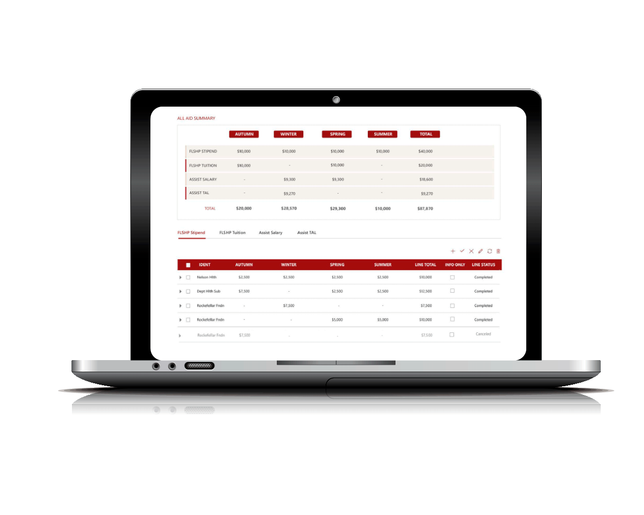
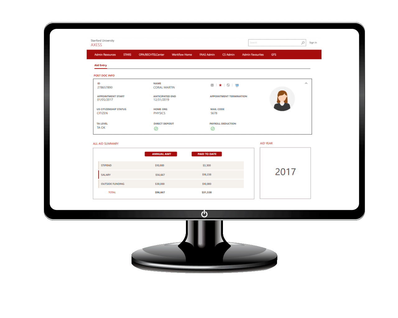
Ramp implemented a web portal platform that access web services from Stanford’s enterprise systems to provide the faculty and students access to their key class schedule, employee and faculty advisor data. The site was responsively designed with key breakpoints defined where content automatically is reconfigured to optimally display on different device display sizes.
Ramp also extended their brand to the online experience with an attractive color palette and creating consistent guidelines for future extensions.
The resulting site provides students and faculty a one-stop-shop for interacting with the university. The user experience is consistent across functions making the tools much easier to use than before. Plus with the responsively designed screens more and more of the student’s and faculty are now accessing and updating their information via mobile devices and this trend is expected to continue to climb. This solution stands as a leading example of employee (and student) self-service in the country.


